

Do you have an existing website or need to create a business website for your new brand? If so, you’ve likely heard how a website needs to be mobile friendly to have maximum effectiveness.
The truth is, your website won’t be successful unless it’s designed to accommodate computers and all types of mobile devices.
Before you start making a mobile-friendly website, it’s first important to understand why this type of website is essential for your continued success.
Table Of Contents
- Mobile Phone Ownership Continues to Rise
- The Importance of Having a Mobile-Friendly Website
- What Does Mobile Friendly Mean?
- The Advantages of a Mobile-Friendly Website
- High-Level Steps to Become Mobile Friendly
- Why Responsive Web Designs Work Best
- What to Avoid, When Converting Your Website
- How Do I know if My Site is Mobile Friendly?
- Test Your Website Right Now!
- Getting Help to Make Your Site Mobile-Friendly
- Download Our Mobile Friendly eBook
Mobile Phone Ownership Continues to Rise
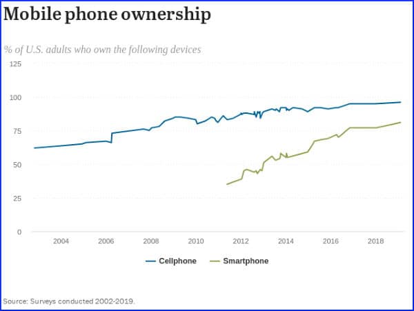
According to PewResearch.org, cellphone use continues to rise. Nearly all U.S. adults (96%) own a mobile phone of some type. This is a 35% increase from just ten years ago.
The great thing about cellphones, is that people are constantly using them. We all check email, text one another, use social media and search online for things to buy throughout the day.
The Importance of Having a Mobile-Friendly Website
All website owners need to have a mobile-friendly website because of the large number of customers that use mobile devices to shop and browse the internet.
In 2019, more than 55 percent of all internet traffic occurred on tablets and smartphones. This means that you ‘re losing out on a sizable customer base by not using a design that accommodates mobile users.
This number is also expected to grow in the coming years. There’s no reason that you should lock yourself out of so many potential customers.
What Does Mobile Friendly Mean?

A mobile-friendly website is any website that has been designed to accommodate users on mobile devices, which could include anything from smartphones to tablets.
Customers who browse the internet on their phone or tablet require websites that:
- Accommodate Smaller Screens
- Are Easy to Navigate
- Use Touch Controls and…
- Can Load Quickly
If your website can be geared towards these four elements of mobile design, you should be able to satisfy customers who shop or browse the internet on a mobile device.
The Advantages of a Mobile-Friendly Website
There are many benefits that come with having a mobile-friendly website, the primary of which is that you will have access to a much larger base of customers.
When a website isn’t designed with responsive functionality. A visitor using a mobile device is forced to zoom-in or out, as well as having to scroll around far too much to get from one area of the page to another. This of course tends to result in a negative user-experience.
The main goal of most business websites is to increase your customer conversion rates. However, a negative user-experience could cause visitors to leave your website to go to your competitor’s site.
Having a website that’s mobile-friendly provides users with a consistent experience across all devices. This helps increase traffic to your website and potentially boosts customer conversion rates.
Websites that accommodate mobile devices are also more likely to receive a better ranking by Google, which is a necessity if you want your site to be successful.
It’s important to understand that there’s no downside towards making your website responsive.
High-Level Steps to Become Mobile Friendly

Making sure that you have a mobile-friendly website is much easier than it sounds. When you want to make a mobile-friendly website, your first step should be to identify how friendly your website currently is to mobile devices, which can be done via a mobile-friendly test that Google provides.
Responsive Web Designs Work Best!
Next, it’s time to select the main mobile-friendly solution that’s right for you, the most effective of which is a responsive design. When this type of design is implemented, your website will automatically work on all devices.
When a mobile user accesses the website, it will immediately switch to the correct screen size so that the user doesn’t need to scroll a lot. Going with a responsive design means that you can avoid needing to create a second website specifically for mobile devices.
Some of the best-practices for mobile optimization that you should focus on include:
- Making the text readable without zooming
- Compressing any images on your website
- Avoiding software that’s not typically used on mobile and…
- Keeping load times at three seconds or less.
Some of the tools that can help you with your mobile search engine optimization include:
- Check your website with the “Google Mobile-Friendly Test“
- Use the Google Search Console to check for crawl errors
- Perform mobile keyword SEO to optimize your page content
All of these tools/tasks will help you improve your rankings on search engines.

What to Avoid
There are a few things that you should avoid when creating a mobile-friendly design if you want the end result to be as effective as possible. For one, it’s important that your website loads quickly. which is why you should avoid larger files and make sure that images are compressed.
Here are a few other things to be careful of:
Avoid nuisance items such as pop ups. Nobody likes them and they can be more of a hassle on cell phones, especially if the link to close them is off the page.
Avoid Large blocks of text. Paragraphs that are too large are much harder to read on mobile devices. They may also scare away visitors with poor eye sight.
It’s also essential that you don’t place any unplayable content on your website that requires software such as Flash to run. This can create lengthy loading issues that turn customers away from your website.
The images you use on your website should also to be optimized to accommodate all types of devices. Avoid images that are too large, they may slow down the load time of the web page.
When you’re optimizing your website for mobile devices, make sure that you don’t block elements such as JavaScript. Doing so can hurt your rankings with Google, which will lead to less visibility for your website.
As long as you focus on speed, responsiveness, navigation, and user experience, you should be able to create a website that mobile users want to visit.
How Do I know if My Site is Mobile Friendly?
For starters, your website must be easily readable on a mobile device. This is according to Google, not you. Now you might think that your current website is OK, but if a visitor needs to resize it or a searcher has to move it around on their device, then your site may not be mobile friendly.
Test Your Website Right Now!
An easy way to know if you have a site that will pass Google’s inspection is to test it. If you would like to test it right now, you can use the link below to see how well your site ranks.
https://search.google.com/test/mobile-friendly?
This is the result that you want to see:

If your site passes, then that’s great! It’s business as usual for you. But if your site does not pass, then you have some work to do.
Help Making Your Site Mobile-Friendly
You can hire someone to make the changes for you. There are several agencies (including ours) that are more than willing to help make your website mobile friendly. If working with an agency is not an option, then you can also do-it-yourself. There are resources on the Internet to show you how.
If you have any questions on how to implement a responsive designed website or need assistance for any facet of website design, contact us today to schedule an initial consultation.

Get Our Mobile Friendly eBook
For a copy of my DIY eBook “The Importance of a Mobile Responsive Website“ visit my website: ThatSearchThing.com and join our mailing list. You will receive a copy instantly when you have confirmed your subscription.


No Responses